But here's the rub. Some designers know digital deeply and intimately, but have very little knowledge of the ins and outs of print production. And print is a very different animal. What you see on screen is not necessarily what you get in final output when a press (even a digital press) is generating the product.
The one thing you must know and discuss with a designer is this: digital colors and print colors are created completely differently, so how do I get a consistently good product for both e-books and paperbacks?
Digital colors are built from lights in red, green and blue (designers call it RGB). The maximum amount of all three combined creates...WHITE! Weird, right? This is how computers create color. If you only do e-books, you're golden. What you see on screen is an excellent representation of the final product.
 |
| RGB or digital color. Image source: wikipedia |
Print colors, on the other hand, are build from inks in cyan (a medium turquoise), magenta, yellow and black (designers call it CMYK). The maximum amount of all four combined colors is...BLACK, like the bottom of the Mariana trench in density of darkness. Because the RGB system of a computer monitor makes color differently than a printing device, what you see on screen is not exactly what you get when output onto paper. There's translation involved. And if you want your paperback cover to look as attractive as you e-book, you need to be careful about color choice.
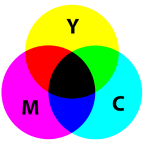 |
| CMYK or "process" color used in printing |
Is you mind blown?
Can you see why you might want to discuss color with your designer? Or, if you're a do-it-yourself-er, why you need to educate yourself a bit?
When choosing solid colors for a design, you need to see swatches from a "process color" swatch book to really know what your output will look like. A nice onscreen color might become a muddy or hazy color when translated to CMYK. This is especially true for darker shades of blue from royal to navy.
Another tip--especially for colored text--you want those colors to be composed of the fewest number of inks. Remember that the print process involves laying down tiny dots of ink next to each other. Newer digital presses are pretty good at staying aligned, but there's always a chance that off-register problems can arise. Here's an illustration that shows the ugly result of misalignment in registration.
 |
| cyan and magenta are misaligned; image from Wikipedia |
For example, when selecting between two emerald greens, such as these two:
| PMS 348: C=97, Y=95, M=17 |
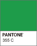 |
| PMS 355: C=93, Y=96 |
If you're planning to only create e-books, someone with expertise in Web design might be perfectly capable of creating a great cover design. If you plan to do both e-book and a paperback, however, it's a good idea to work with a designer with some print experience. And the more you know, the better you'll be able to communicate and make wise decisions.
And do-it-yourself-ers, take the time to learn about the print process. A few resources I recommend are:
Printing and Prepress Basics
Claudia McCue's book Real World Print Production with Adobe Creative Suite Applications
From Design Into Print: Preparing Graphics and Text for Professional Printing by Sandee Cohen
The Non-Designers Design Book by Robin Williams
Do you feel more empowered as a consumer of design services? What other questions or concerns do you have about producing print books?


Great post. I'm lucky to have a husband who does specializes in print material and has done a number of book covers, so if I ever decide to self publish, I'm set.
ReplyDeleteHaving the right experience makes all the difference.
DeleteThere's a lot to consider that I hadn't even thought of. I'd definitely want to hire someone really experienced.
ReplyDeleteIt makes a huge difference to work with an experienced designer. I worked in graphic design for seven years, but it was my cover designer who tipped me off about the "simplest color" tip for getting best results. Especially because vendors like CreateSpace outsource printing and you can't do press checks, everything you can do to prevent problems early on is helpful.
DeleteI knew none of this. I'm looking at possibly self publishing soon, and will make sure my designer is able to do both well. Thanks for the education of the process and difference, Laurel. :D
ReplyDeleteYou're not alone. Only those of us who've handled both content and production usually do, thus I thought it would be useful to cover. All those years I did graphic design have come in handy for sure.
DeleteAs you take steps toward going Indie, _The Non-Designer's Design Book_ might be worth a look to get you up to speed so you can communicate well with a designer.
Very good to know! Thanks!
ReplyDeleteGlad this info is useful to you. Forewarned is forearmed, as they say.
DeleteNow I know what my cover designer meant by RGB and CYMK. So thanks for the explanation.
ReplyDeleteAnd I do understand from experience that print and e-versions sometimes come out in totally different colors. Two of my books had a conversion from e to print.
Nothing like having to grapple with this personally to make the concept stick, right? Did you end up changing the color palette altogether to get a more consistent look between the digital and print covers?
DeleteThis is all new to me! I don't see myself going into Indie any time in the foreseeable future--I really just don't have the patience for it--but it's interesting to see how processes differ nonetheless. Cool stuff!
ReplyDeleteIf you end up going small press and have to do some of your own marketing, this is stuff that's good to know when creating any printed materials--bookmarks, brochures, a press kit. etc.
ReplyDeleteJust found this article. Thank you Laurel for the tips and references.
ReplyDelete